Back to the doors
Local time—•

UI/UX Design

Design decisions, shown with the system behind them: the colours, the type, the components, and the reasons.

Brand and storefront · Case study

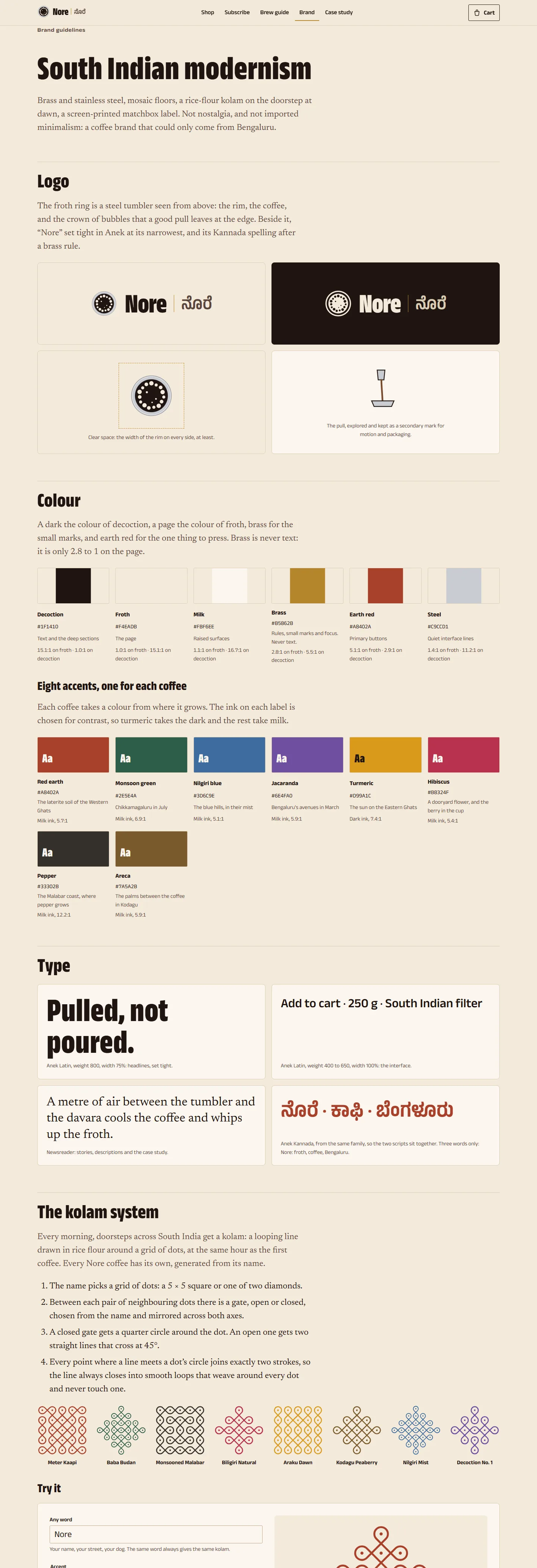
Nore

A coffee brand that is neither nostalgic nor imported

A name, a wordmark in two scripts, colours taken from where each coffee grows, and a generator that draws every coffee its own kolam. Then the shop decisions: the grind defaults to filter, the price is shown per cup, and the subscription is something you build rather than a pricing table.
  • Identity
  • Design system
  • E-commerce UX

Product design

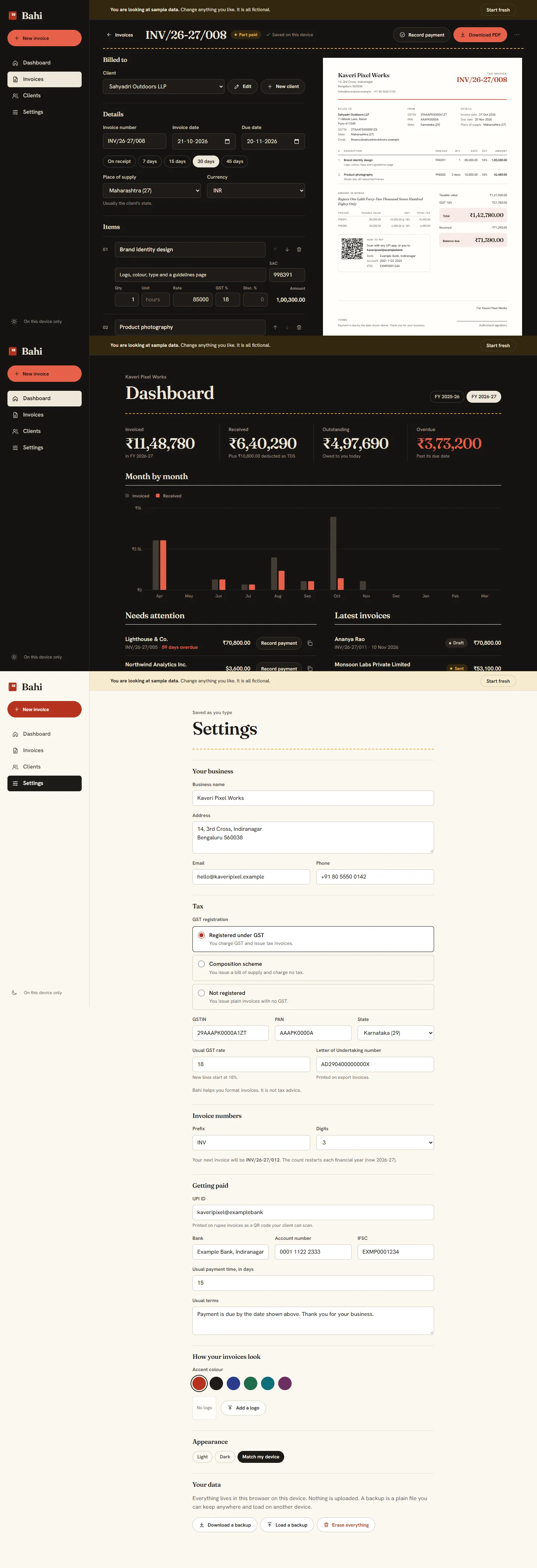
Bahi

A tax tool that feels like paper

The interface borrows from the red ledger it is named after: cream paper, dark ink, one red, a thread of yellow. The hard part was making tax explain itself, so the totals panel says in plain words why the numbers are what they are.

  • Design tokens
  • Forms
  • Light and dark

Product design

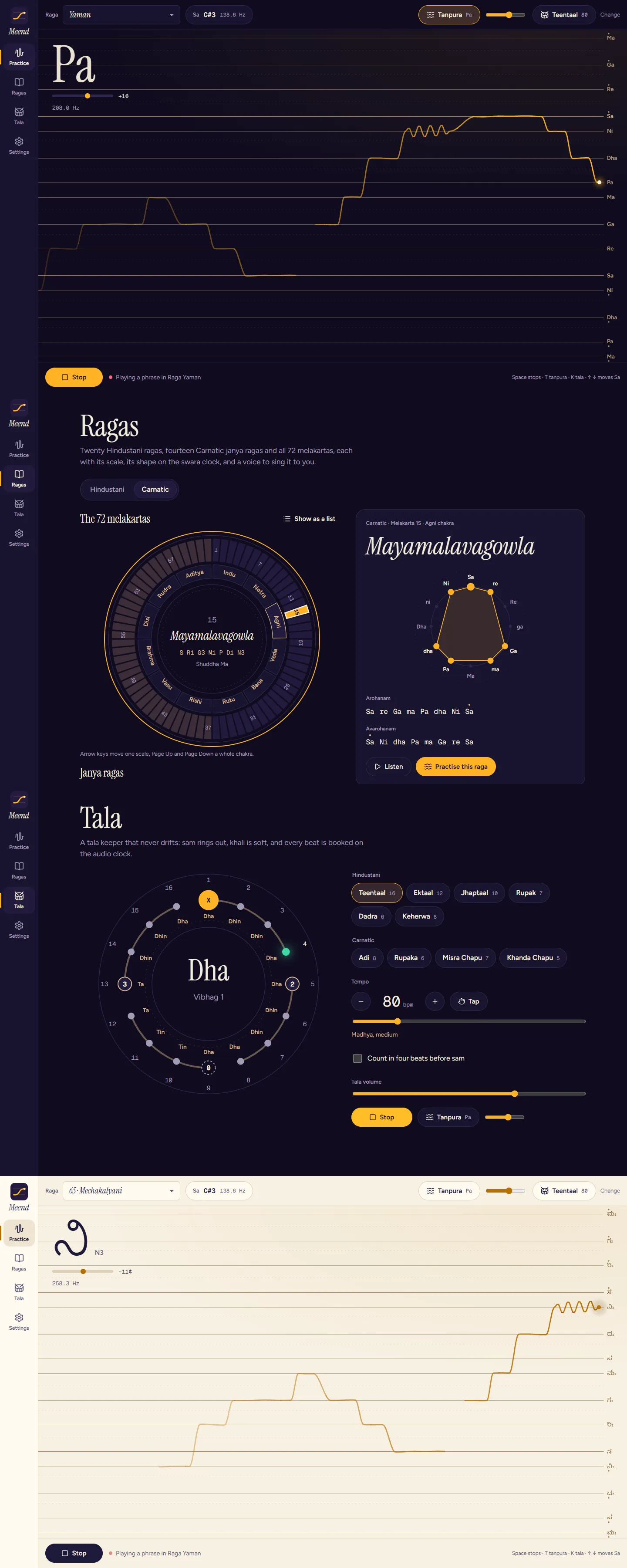
Meend

An interface you read from a music stand

Designed for a phone propped a metre away: one glowing line, very large note names, and colour that tells you in tune from out of tune without reading anything. Two themes, several scripts, and a wheel of all 72 parent ragas.

  • Data visualisation
  • Mobile-first
  • Accessibility

Information design

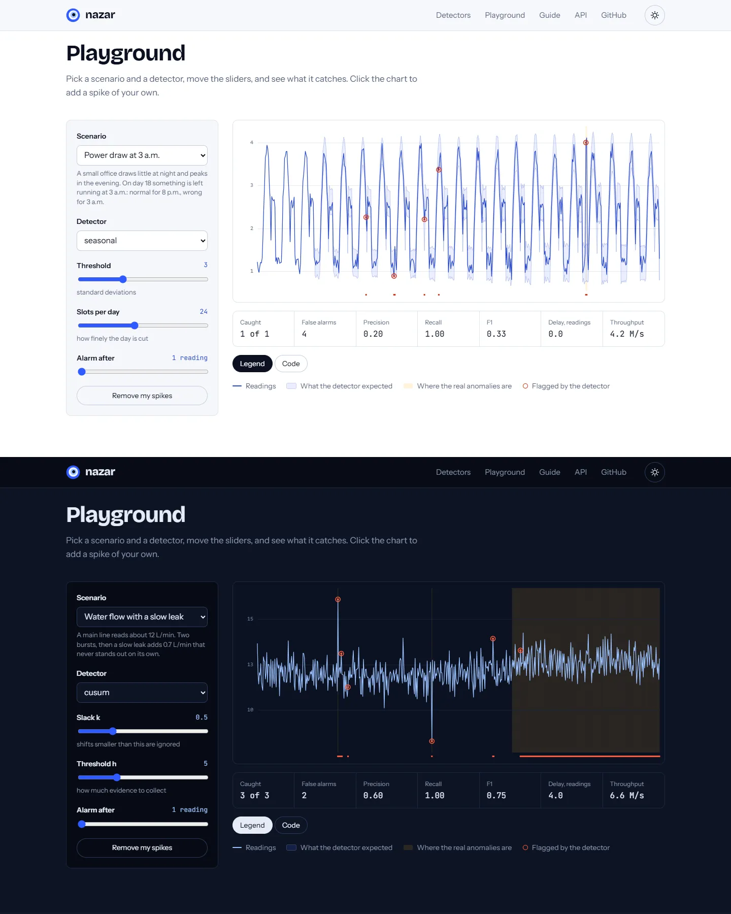
Nazar

Making an algorithm visible

A playground where every slider redraws the chart, the detector's judgement is drawn as a band around the signal, and the code for whatever you just built is one tab away.

  • Charts
  • Interaction design
  • Documentation